Nomad Travel.
A boutique travel brand built from scratch — identity, web, and booking experience in one cohesive system.
What needed to change.
Nomad Travel was launching as a boutique travel startup targeting remote workers who wanted curated, work-friendly destinations. They had no brand, no web presence, and 3 months to launch before their seed funding ran out.
The travel booking space is dominated by platforms optimized for price comparison. Nomad's differentiation was curation and community — they needed a brand and web experience that communicated "we've done the research so you don't have to" without feeling like a generic travel blog.
How we got there.
Brand Discovery
Ran a 2-day brand sprint with the founding team. Defined brand personality (curious, considered, quietly adventurous), identified 3 competitor archetypes to differentiate from, and established the core brand promise.
- —Brand sprint output
- —Competitor differentiation map
- —Brand personality framework
Visual Identity
Developed 3 distinct visual directions — Cartographic (map-inspired), Editorial (magazine-style), and Earthy (natural textures). The client chose a hybrid of Cartographic and Editorial, which became the Nomad visual system.
- —3 visual directions
- —Selected identity system
- —Brand guidelines (40 pages)
Content Strategy
Defined a content model where each destination had a "Nomad Profile" — work infrastructure, community vibe, cost of living, and a curated weekly itinerary. This became the core content unit that the website was designed around.
- —Content model
- —Nomad Profile template
- —Photography art direction guide
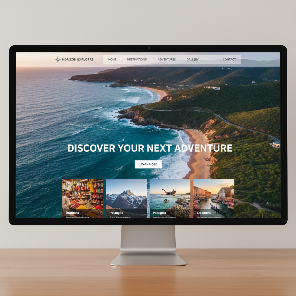
Web Design & Booking Flow
Designed a website that led with destination stories — full-bleed photography, first-person narratives, and community reviews — before presenting booking options. The booking flow was designed to feel like a concierge conversation, not a form.
- —Website design (12 page types)
- —Booking flow prototype
- —Mobile-responsive specs
Launch & Iteration
Launched with 8 destinations. The waitlist hit 2,400 in the first week. Iterated on the booking flow based on drop-off data, improving conversion from 22% to 34% within 6 weeks of launch.
- —Launch metrics report
- —Booking flow iteration log
- —Design handoff documentation
A complete brand identity system — wordmark, color palette, photography style, and voice — paired with a booking website that led with destination stories rather than search filters.
Story-First Booking Experience
Instead of leading with search filters, Nomad leads with destination stories. Users read about a place — the co-working spaces, the neighborhood, the community — before they ever see a price. This builds desire before presenting a decision.
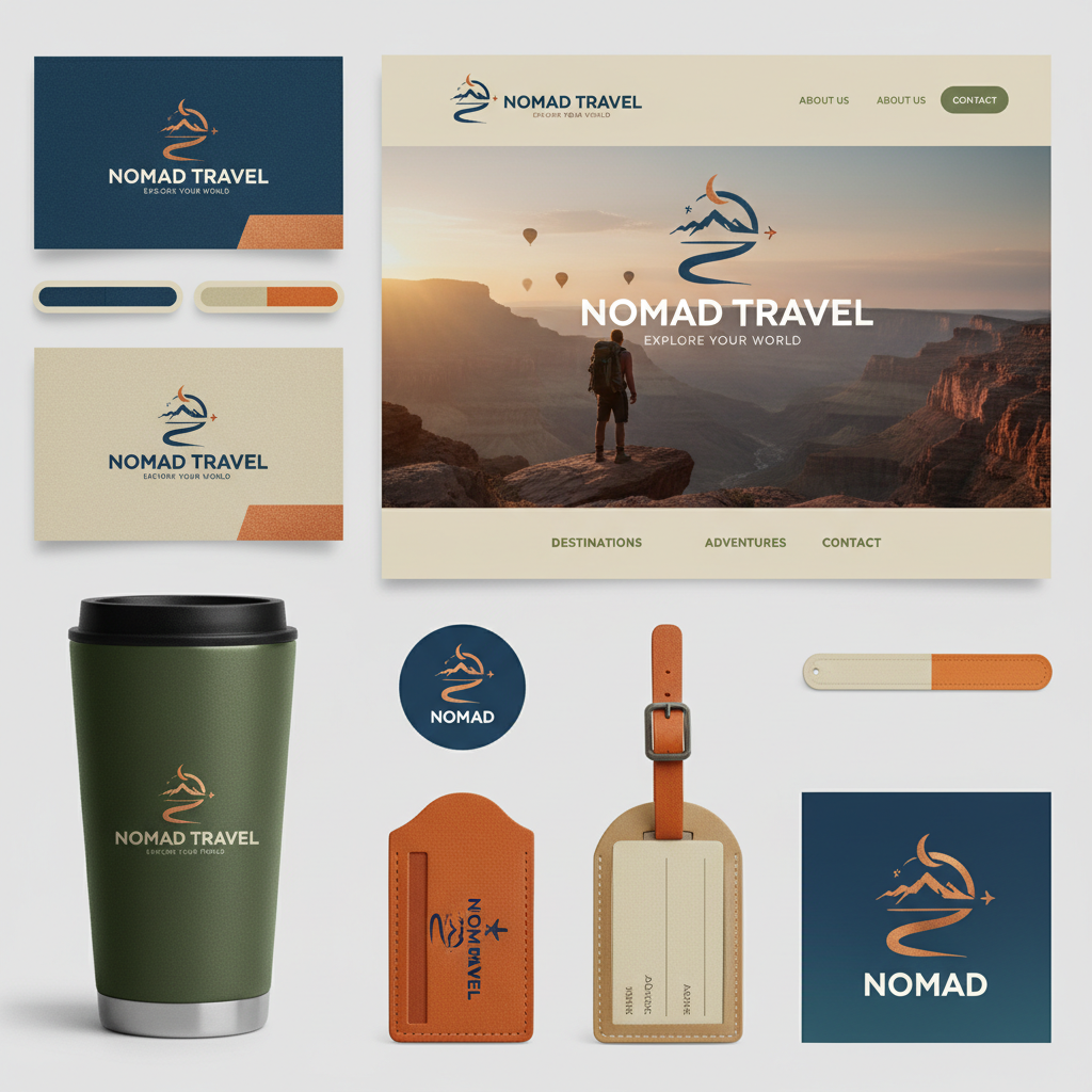
Cohesive Brand Identity
The Nomad visual system draws from cartographic traditions — subtle grid lines, coordinate typography, and a color palette pulled from topographic maps. It signals "we know this territory" without being literal about travel.