Meridian Finance.
Redesigning a fintech dashboard for 200K+ users — clarity over complexity.
What needed to change.
Meridian Finance’s existing dashboard was built incrementally over 5 years — resulting in a fragmented experience where users needed an average of 9 clicks to complete a routine transaction.
User research revealed that 67% of daily active users relied on only 3 core features, yet those features were buried under layers of navigation. Support tickets related to navigation confusion had grown 40% year-over-year. The business needed a redesign that could scale without alienating its existing power users.
How we got there.
Discovery & Research
Conducted 18 user interviews across three user segments — retail investors, small business owners, and financial advisors. Ran heuristic evaluation of the existing product and competitive analysis of 6 fintech platforms.
- —User interview synthesis
- —Heuristic audit report
- —Competitive landscape map
Define & Frame
Synthesized research into 3 primary personas and mapped their critical journeys. Identified 12 key friction points and prioritized them using an impact/effort matrix with the product team.
- —Persona documentation
- —Journey maps
- —Problem prioritization matrix
Ideation & Architecture
Ran 3 design sprints to explore navigation models. Tested card sorting with 40 participants to validate a new information architecture. Explored 5 distinct dashboard layout concepts.
- —Card sort results
- —IA sitemap
- —Concept sketches (5 directions)
Design & Prototype
Built a high-fidelity prototype in Figma covering 60+ screens. Established a new design system with accessible color tokens, a data visualization library, and responsive grid specifications.
- —Design system
- —Hi-fi prototype
- —Interaction spec documentation
Test & Iterate
Ran 3 rounds of usability testing with 8 participants each. Iterated on navigation labels, data density, and the onboarding flow based on findings. Validated final designs with A/B testing in production.
- —Usability test reports
- —Iteration log
- —A/B test results
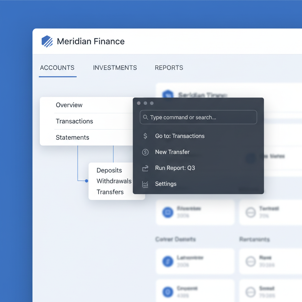
A complete information architecture overhaul, surfacing the most-used actions to the top level, introducing a command palette for power users, and rebuilding the data visualization layer with accessibility in mind.
Simplified Navigation Architecture
Collapsed 7 navigation levels into 3. The most-used actions — portfolio overview, transactions, and alerts — are now accessible within 2 clicks from any screen. A persistent command palette (⌘K) lets power users jump anywhere instantly.
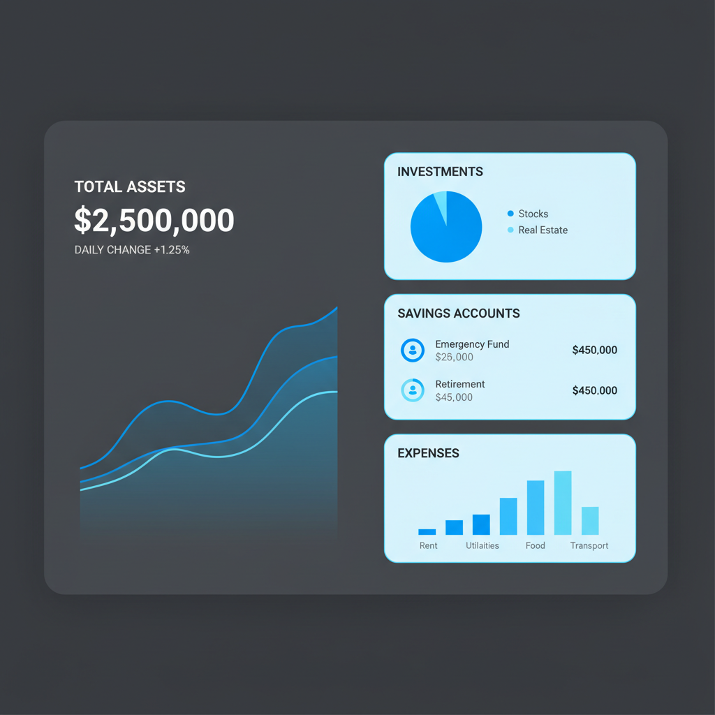
Accessible Data Visualization
Rebuilt all charts with WCAG AA contrast compliance and pattern fills for color-blind users. Introduced progressive disclosure — summary numbers first, drill-down on demand — reducing cognitive load for casual users while preserving depth for analysts.